The Apple Shader
Logic behind an apple material 1
Bumps and roughness on spots 7
Distortion Scale and Distortion Strength 16
Only bump Distortion, don’t want any color change. 20
Introduction
Before we begin, the .blend file for the Shader can be fetched here:
This document will go through how you as a user can work with the group node, the logic behind it and all the technical aspects that finally got this result.
To make a “perfect” result it might be so that you add your own input to your material, but I think this group node will cover most basic needs anyway.
Logic behind an apple material
Apples come in a lot of shapes, colors, structures and sizes. Still they have some common features. Of what I could see from reference pictures most of the apples have these things:
- Spots/dots.
- Some lines/stripes going in a vertical direction.
- Color variation that often lays in a horizontal direction, like yellowish on top going towards red in the middle and then perhaps it goes to a more yellow color again in the bottom.
- A mix of stripe and main color.
- More general variation of colors. Here also aging of apples comes in play, so a third color must be used on many cases.
- Then some distortion on stripes and colors of course.
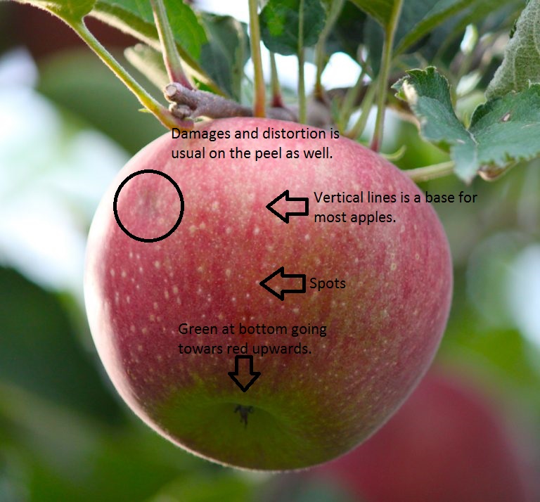
All this things vary a lot of course. Some apples have almost no stripes, while others have them clearly visible and so on.
The trick here will be to control the surface to provide just the correct amount of color, stripes and dots visible.
Even if I build a node tree specific for only one apple, it will be a lot of parameters that I would need to change, thus I need a way to simplify it.
The answer is to make a group node. Then I only see the parameters needed to change and I also have much clearer names on every parameter.
One additional advantage then also will be the fact that I can use it in a more flexible way, allowing that the same node setup could be used on several types of apples. It could even be so that the apples shape, structure and color could be generated by random.
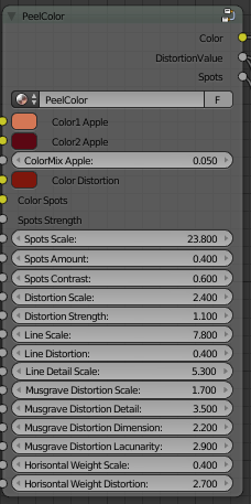
The Group Node “PeelColor”
The group node designed is called “PeelColor”. It has about 15 different parameters and before start using them it could be good to know how to work them. There are also a few outputs of course.
The complete Group Node looks like this:
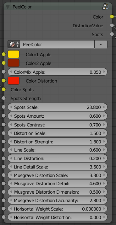
Since it can be overwhelming just fiddling with everything and get it to work, I will divide every sub chapter into these specific bullets points I mentioned above so that you know what controls the spots, the stripes and so on.
Spots
We start with the spots. They are arranged in the Group Node like this:
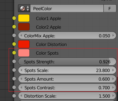
You also have an output for “Spots” if you would like to bump them a bit.
If you set spots Strength to 0, you of course will not get any spots on the apple. However, the “Spots” output will still tell you where they will be, so you can enhance them just using a bump vector if that is suitable for the apple you are doing.
Let’s start. If you put every parameter to 0 and use clear green for all colors except a white spot color first and then change the spots parameters like this:
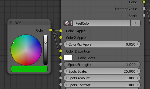
You will end up with the following result:
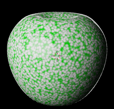
A higher scale of the spots will give smaller spots. I would suggest a value between 20 to 60, depending on type of apple, to get a nice size of the spots.
However, it’s not only the scale that changes the size of the dots in this group Node. The end size depends of amount as well. The size will go down a bit if using fewer amounts of dots.
So, if I change the amount to 0.2 instead of using 1.0, the apple will now look like this:
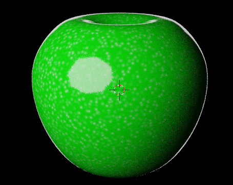
As you can see the size has decreased even if the scale remained the same, so you have to mix scale and amount in a good way to get what you are looking for.
The reason I built it like this is that you now also have a third parameter… softness! After checking the ref. images I saw that you will never have a few large hard spots… they will always be soft in the edges, while smaller ones can be a bit harder. With this knowledge most types of spots can be created.
So, if I want large soft spots, I set my parameters like this:
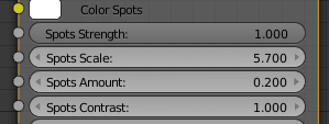
…and get this:
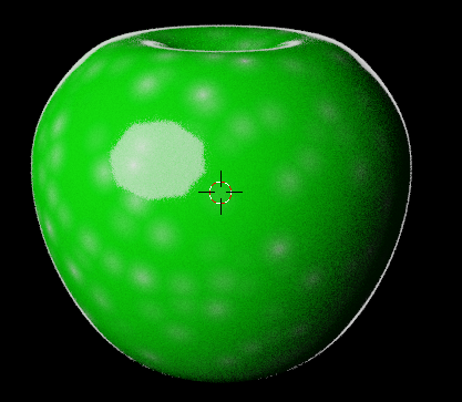
Now…if you still want your dots or spots to be very visible and decrease the softness a bit, then just increase the contrast.
Here is an example of 10.

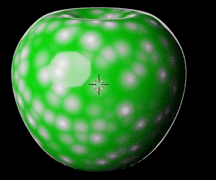
Finally you can also decide how much you want the spots to blend into the main material using the spots Strength.
Same settings above, but decreased the strength to 0.1 will give this:
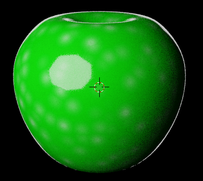
Bumps and roughness on spots
If looking at the image/photo that I have in the documentation in the beginning, you’ll see that the dots are bumped outwards a bit. To achieve that on your apple, you’ll just connect the output “Spots” to a vector bump. Try these spot settings:
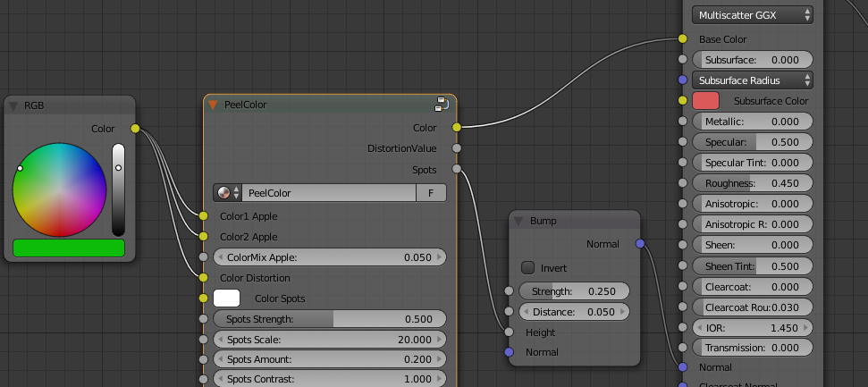
It will result in this image:
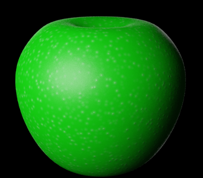
Now you can see the effect! It has not to be much at all. In this case I used a distance of 0.05 and it can a number of time be even less.
However, bump is not all. To get a good looking apple you also have to change the gloss/roughness for the bumps compared to the apple itself. Some cases could be that you are only using the roughness without color or bump.
It could look like this:
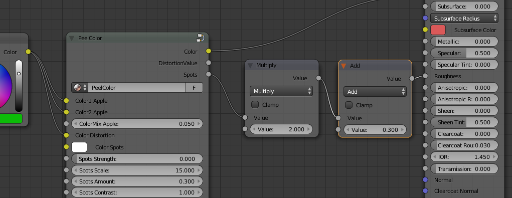
With this result:
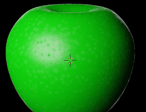
You can clearly see the spots…even if they don’t differ in color or have any bumps, because they are less shiny than the rest of the apple. If they should be less or more shiny depends on type of apple. Also on some apples the bumps go inwards.
The total output value to give to bump and/or roughness is controlled by the parameter “Spots contrast”. With a high contrast, you get high output numbers and with a low…you get a low output.
So, if I keep all settings as they are… but change the contrast to 10, I’ll get this result for my roughness:
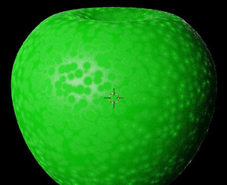
You clearly see the difference :).
The stripes
Ok, so now you know a bit about the dots, so the next natural thing to handle is the stripes.
To create stripes we need one color for the stripes and one for the main apple.
I’ll use “Color1 Apple” and “Color2 Apple” for that. Reset all settings to zero and connect two colors like this: 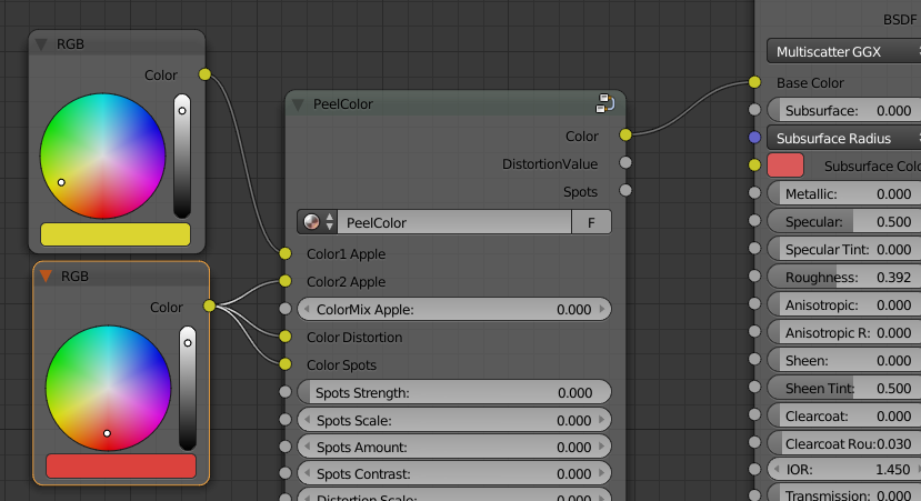
That will give you this kind of apple:
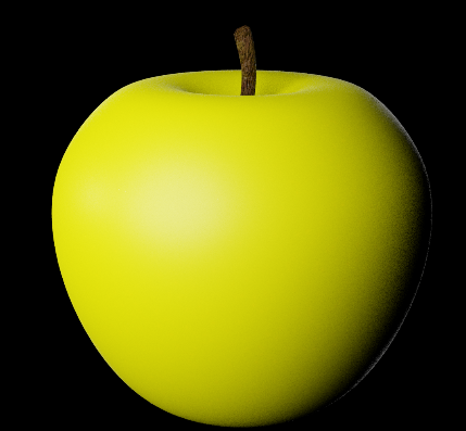
As you can see of the result you will get a yellow apple. This follows pure Blender Logic, so a ColorMix of zero gives Yellow in this case and a ColorMix of 1 gives a red apple here. Since we use some math behind the curtains you can go below 0 and above 1 and it will affect the mix a bit as well, but standard is between 0 to 1.
Adding the lines
Now when we have the base on place, we change the mix and increase the line scale:
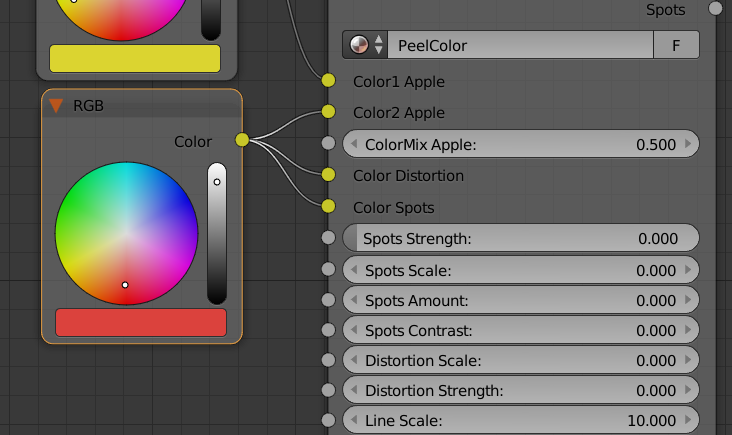
This will give this apple:
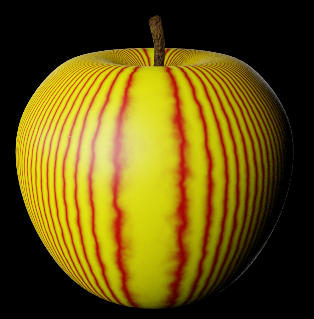
Now we have the stripes in place.
However…it does not look like an apple. Before I explain further, change the Line Scale to 0.1. Then your apple will look like this:
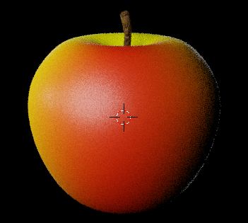
This still looks rather bad, but better than the hard lines. Now start increasing the Line detail scale to around 0.2
When reaching 0.2 your apple should look like this:
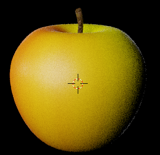
Do you feel it… the apple color? Yes, it feels much more like an apple now. The “Line Detail Scale” will spread or scatter the existing lines more, so normally you can use rather low number in “Line scale” and then spread it by increasing the level of detail.
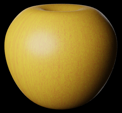
Some apples have almost like just dotted lines. Very thin lines, almost invisible. To create those types of lines you put the “Line scale” to like 10 and then just increase “Line Detail Scale” to like 30. This will give you an apple that looks like this:
If you want the yellow to be stripe and the red the main apple, then just change the ColorMix towards a low number like 0.2 or so…and vice versa if you want even more yellow in it.
Distort the lines.
The distortion works almost in a horizontal view for the lines, since they are straight vertical from the beginning. Let’s demonstrate. Set the parameters to the following:
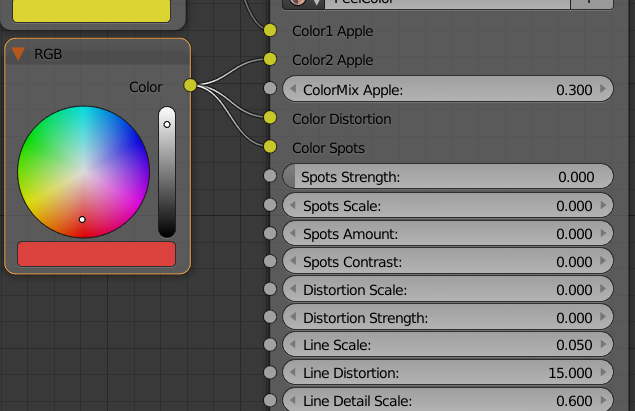
This will create the following result:
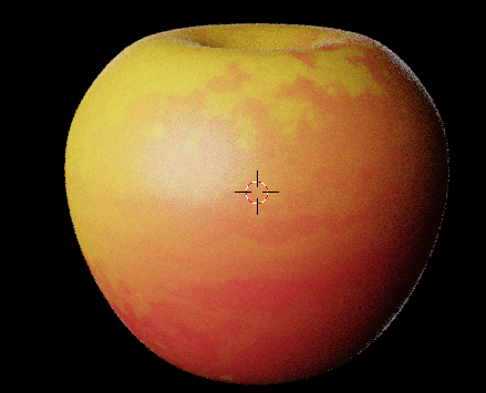
As you can see we have now turned the lines to be almost horizontal. I use a high amount of distortion to achieve it and normally I don’t think you will use this high number, but now you have a clue at least.
I will give some more examples. Use this setting instead:
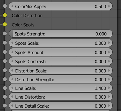
No distortion and the apple will look like this:
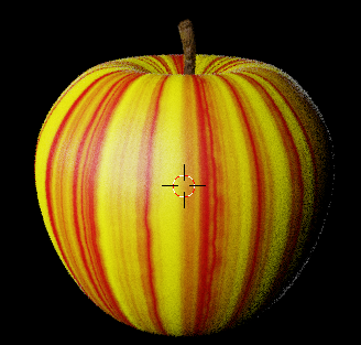
It’s rather nice lines going down the apple. Now we just change the Line Distortion to 0.2, so not that much:
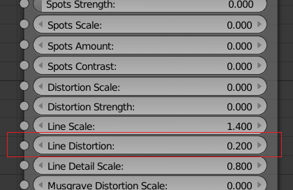
Result:
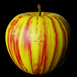
As you can see, the lines are now more floating down the apple. The direction changes a bit vertical as described earlier when using the line distortion. In what direction the angle will go towards the vertical is depending whether you add a negative or positive number as distortion.
Now the lines are very visible and the contrast between the main color and the stripes is huge. That means that it does not look like an apple. You can select colors that are closer to each other and you can also change the mix a bit to get it better, but you will always feel that something is missing, so let me introduce the more general distortion.
Distortion
As I wrote above, we need something more to make an apple look good. Distortion is the answer to almost everything that should look realistic, so this shader comes with two types of distortions. One Distortion is built on the noise texture and one on the texture that is called “Musgrave”.
Together with the lines and the spots they can handle the most variations demanded from different apples.
Distortion Scale and Distortion Strength
You have two types of distortion to use, if you exclude the line distortion.
The first type of Distortion is based on a “Noise texture” and have these parameters:

The color for Distortion is also connected to this distortion.
A low “Distortion scale” will create large areas on the apple while a high “Distortion scale” will create smaller areas of distortion. How hard the distortion will be in color and output for the bumps is decided by the “Distortion Strength”.
Let’s take the apple we had above as an example, so we keep the settings as we had, but add some distortion. In total it will look like this:
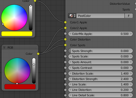
This will give the following result:
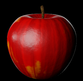
Have you seen this “wow” result?! This is an apple!
We are still very high in contrast between the yellow “Main color” and the red stripes, but when we now use the distortion it will act as a layer above and merge into the other colors. The result is a soft tone between the colors. In this case we only use two colors, since the “Color Distortion” is using the same red as the stripes. However, since the colors are added to each other it will darken underlying red.
I have added the bump vector to the apple, so that you can see how it also affected the end result of the apple.
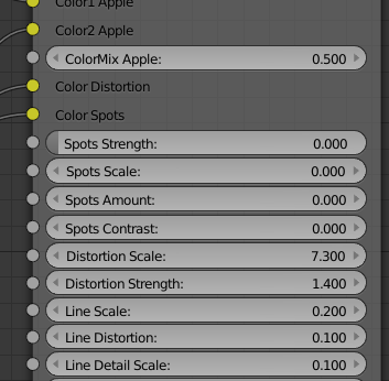
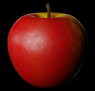
There are many ways to attack distortion here. In some cases you will just use it to get some bumps and a slight color change on the apple. In this case you use fewer lines and a rather low scale on the strength and some higher on the scale. The settings might look like this:
..and the result:
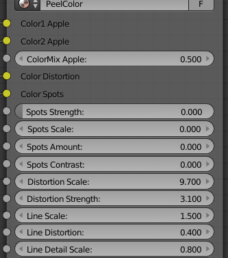
It could also be so that you want just a few yellow spots on a red apple. Then you increase the strength of the distortion, so it uses more of the distortion color. The smaller of the yellow you want…then increase the scale of the distortion. One example would be:
Result:
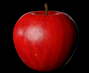
As you can see there are new a few yellow spots as well. This makes it more believable.
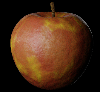
You can experiment a lot with this. I will give a final example where I destroy the apple completely (aged). Settings:
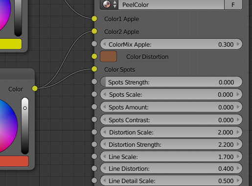
I use three different colors, so I have a more brown tone for the distortion. The result:
Only bump Distortion, don’t want any color change.
If you just want to have the bumps in place, then that is very easily fixed. Just put the Distortion Color to completely white and it will not be mixed with the other two colors. However, the output will still deliver a bump value that you can use.
Musgrave distortion
The other type of distortion you have is the Musgrave distortion. This distortion uses the same color as the stripes (Color2). It can be used for plenty, but mostly I use it for getting old spots behind the skin of the apple.
Musgrave can be hard to grasp, but if you follow these thumb rules it will work:
- High amount (> 3) of detail gives smaller spots
- Lacunarity shapes it in to harder smaller areas when it goes up. Below 1 you will hardly notice anything, but when it comes to 3 to 5 in value it will be very visible.
- The dimension sets how fluffy and big an area should be. No dimension = sharp and small.
Ok, so we do a test setting like this:
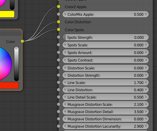
This results in the following:
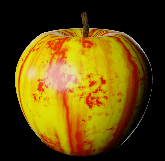
You see those stains? That is the Musgrave. I use the dimension 0 to make them as sharp as possible. Now change the dimension to .5 and see the difference:
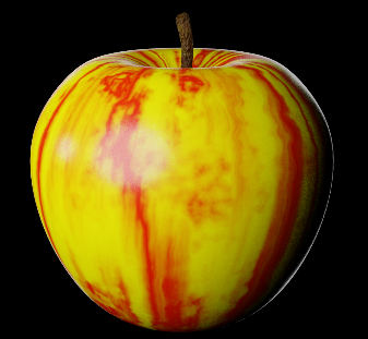
You can now see that the stains are weaker and smoother. So, you can by the dimension decide how visible the stains should be in the peel.
The Musgrave will also blend when you use the ColorMix, so if I have this setting:
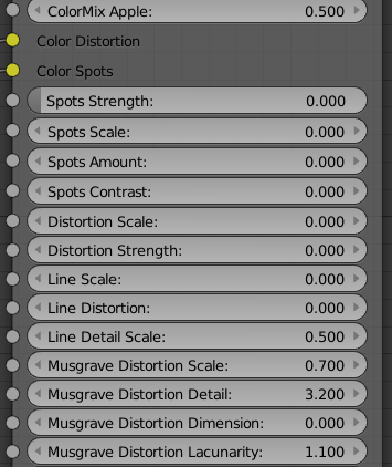
I get this red Musgrave area:
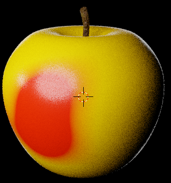
This can be smoothened in two ways. Either I increase the “Dimension” parameter or I lower the colorMix value. In both cases it will look like this:
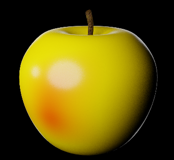
…but the ColorMix will lower the amount for both stripes and Musgrave while the dimension parameter only will affect the Musgrave.
As with noise distortion, you have to test a lot to understand the concept of how it will distort things… but now you know the basics.
The Horizontal parameters
The last thing you can do to create your apple pattern is to use the two horizontal parameters. These are for the apples that have one kind of color at the top and another in the bottom. Try this setting:
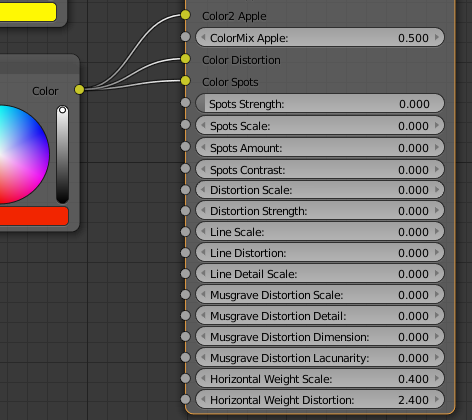
The weight scale sets how many horizontal lines you want. Normally this is low. With the distortion parameter you can move the lines up and down and make them mix a bit differently with the other distortions and ColorMix parameters that you have.
The result for the setting above would be like this:
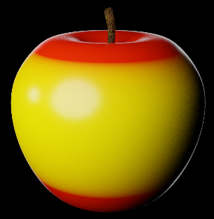
This is to clearly see how it works. I will now change the settings lightly so it looks like this:
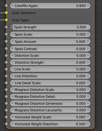
Now the result will instead be like this:
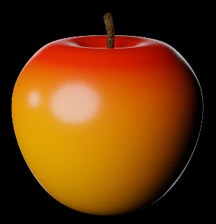
As you can see I get a smooth red top that slowly goes towards yellow at the bottom. Even if my apple image looks like it’s carved in wood and painted on the image above you get the picture.
The force is in combining all these parameters!
Add the structure.
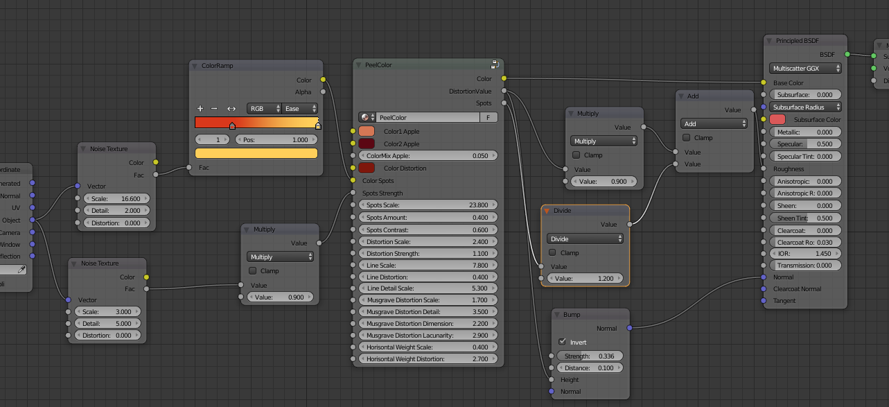
To make an apple (or any other object) look real, you must have some variation in your roughness. To achieve that you can use the two output values “DistortionValue” and “Spots”.
Mix them with a vector Bump Map and some math and you are good to go. Let’s start with a basic apple. Settings like this (I now use all things that you have learned above, except Musgrave):
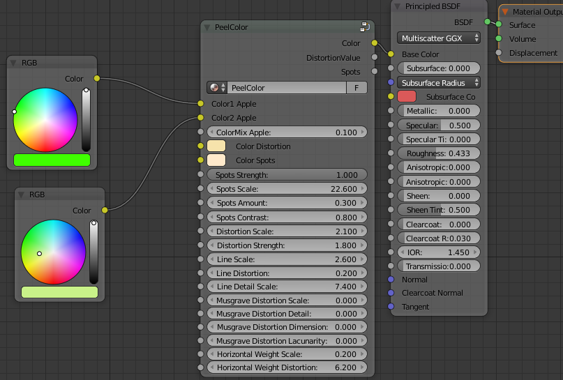
It results in this apple:
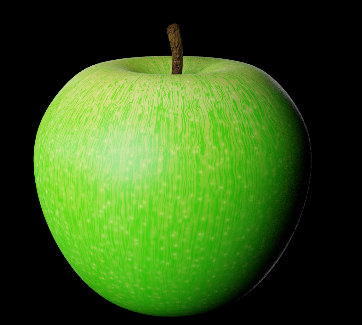
This looks like an apple, but it lacks that final touch with bumps and structure.
Let’s start with the structure.
Add two vector Bump maps. Connect each bump map to the outputs like this:
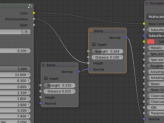
The result would be something like this:
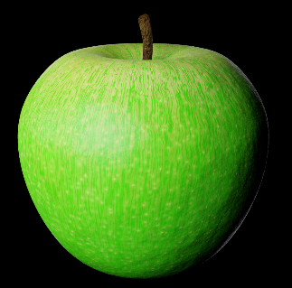
If you compare it with the previous image, you can see that it got some structure now. The same nodes… but with slightly different settings could be used for all types of apples.
The only thing left is to also add some variable roughness.
To make that work I’ll use the same output nodes, but connect two math nodes to them. One math node will be “Multiply”. Here you control the difference between high and low roughness. A High value in this math node will make a big difference in high and low value.
The other math node will be an “Add”. This is to set the basic roughness.
First we can do this on the general distortion. It will look like this:
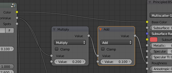
Since I will make a rather shiny apple, I put the value in “add” low. The variations are not that big between gloss and roughness, so also the multiply node will get a small value.
Result:
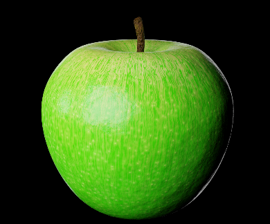
The apple is now more alive. It can be that I have used a little too high value on the distortion, but anyway…this is the result.
As a final touch I can duplicate the math nodes for the spots as well. If I want them to shine more than the rest, then I’ll subtract the value from distortion… or else I add it. In our case we make the spots shine a little more, so I will subtract. The setup:
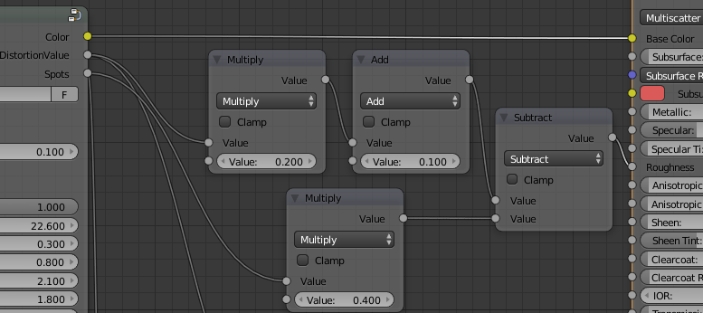
It will not make that much of a difference, but also the subtle changes are needed. Beware that my setup above will get the spots to also affect the original roughness, so in the case here the complete apple will get a tiny bit more gloss since the end value for roughness will be lower if subtracting from it.
Anyway…result:
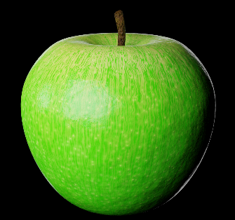
Congratulation!! Now you know how to use the apple shader!
Advanced use
To make full use of this Group Node, you should look at it as any node. You can input different textures, colors and values in all the input nodes so if you need more colors than the Group Node gives then just create a colorramp with many colors connected to noise texture or similar.
You can also use two or three “apple peel Shader” nodes at the same time. Look at this little apple:
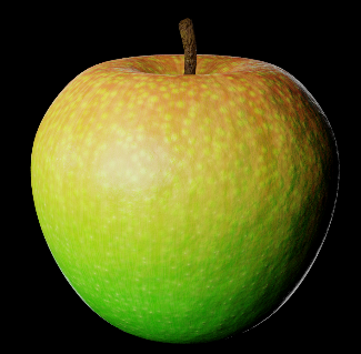
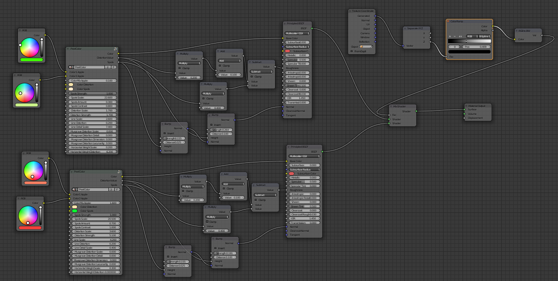
You can clearly see that it is using two shaders. The top has big spots visible, while the lower has more and smaller. There are also more bumps on the top, other colors and so on.
What I did, was just to duplicate what I had and then change parameters on one. I will show the node setup on distance, because the amount… but I think you understand the logic on how to do it.
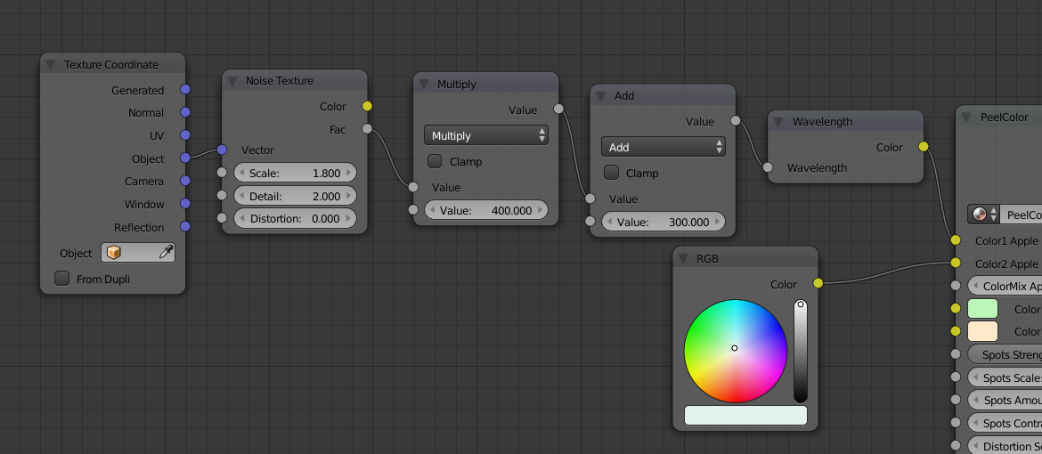
To make this “Earth Apple”, I connect a “Wavelength” node to the color input:
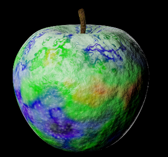
Node setup:
…if I just change the transmission to 1 and the IOR to 0.850 on my Principled Shader I get this:
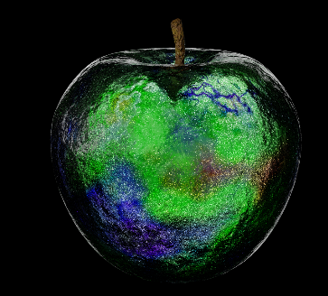
So, as you understand there are unlimited possibilities, but the basic PeelColor Group Node will help you almost all the way to create great apple peels.
Examples:
Granny Smith
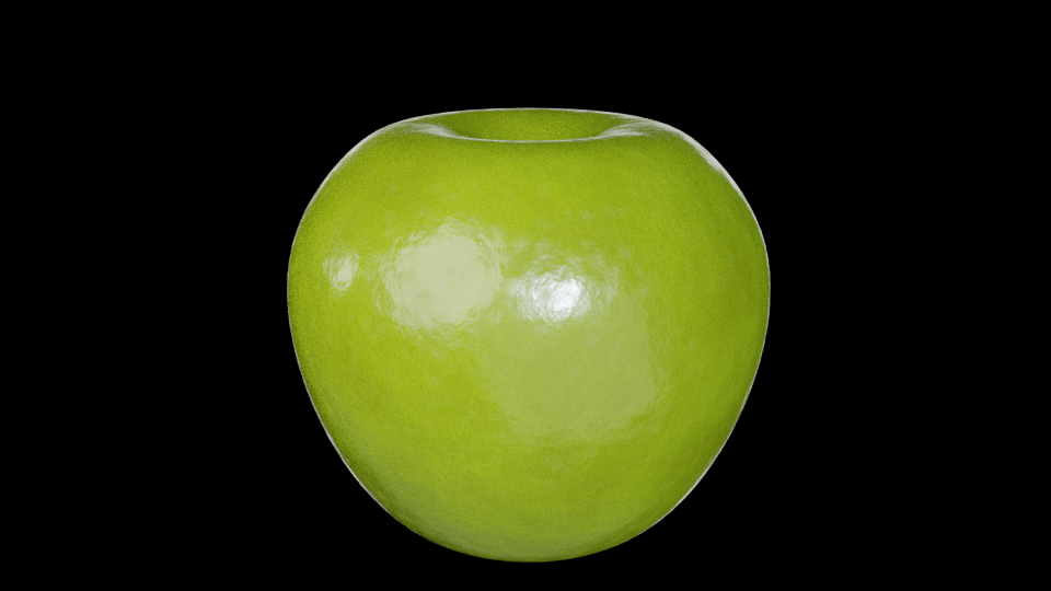
Nodes:
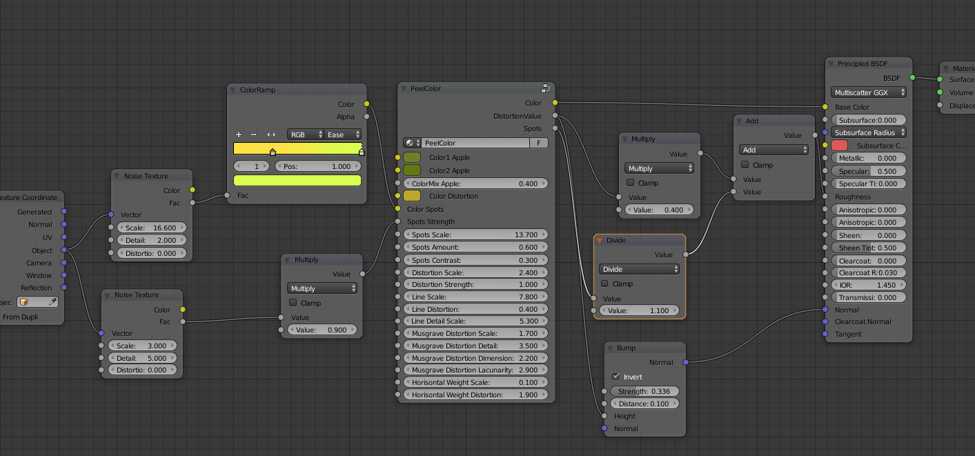
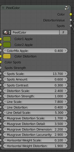
Aroma
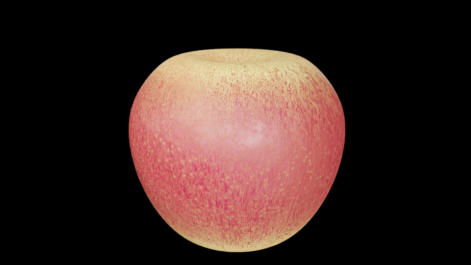
Nodes:
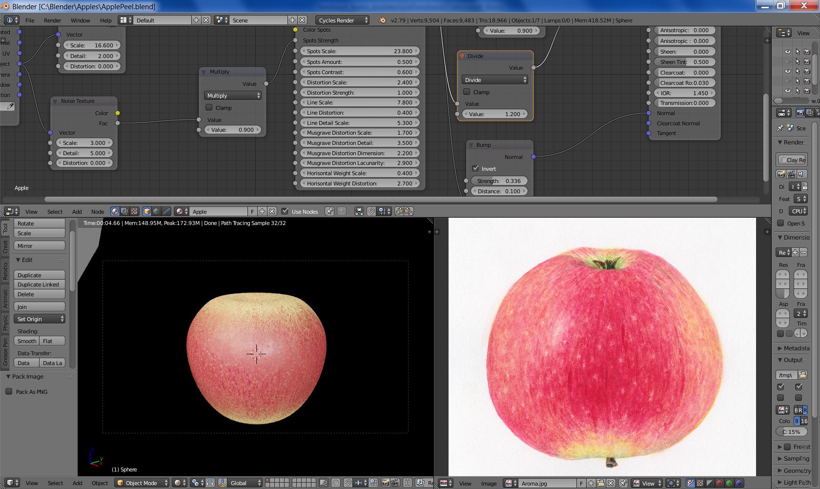
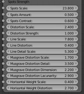
Alice
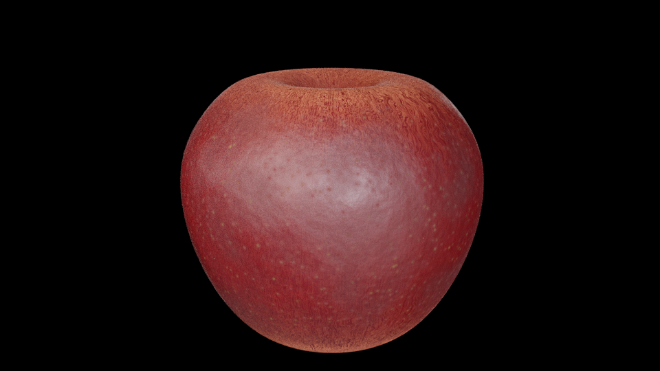
Nodes:
